UI concepts.
Five visual systems.
Designed and built by me.
I explore how an interface's visual language changes the experience of using it, then build that language into components and working showcases.
Fieldwork UI
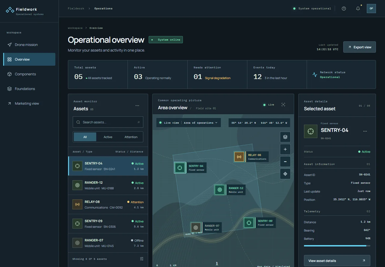
A clear view of a complex system.
The design
A dark operational workspace with restrained typography, fine borders and status colors. An asset list, central map and detail panel share the same selected state.
What I built
A React and TypeScript showcase with asset search, filters, linked selection and reusable interface components. The kit includes panels, detail rows, status indicators and dialogs, plus an aircraft and mission-interface concept.
View full screenshot ↗Glyph UI
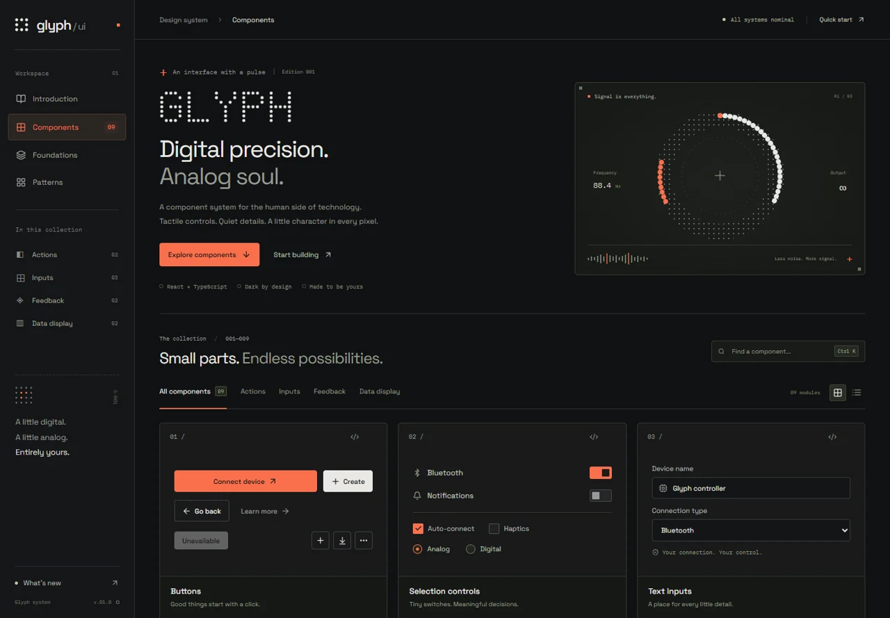
Digital precision, with a tactile character.
The design
Graphite surfaces, square controls, signal orange and dot-matrix details bring the language of physical devices into a web interface.
What I built
A React and TypeScript component kit with buttons, switches, inputs, segmented controls and modal dialogs. The showcase includes component search, density controls, code examples and shared device settings.
View full screenshot ↗Lore UI 2
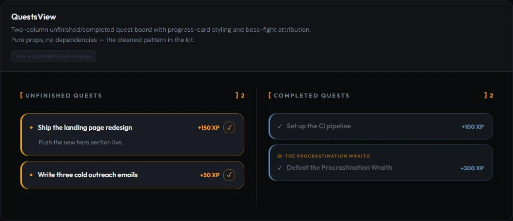
Reusable pieces of a game-like interface.
The design
Quest cards, dialogue and feature tiles give tasks and navigation a game-inspired visual language.
What I built
I extracted reusable primitives and patterns from Lore into a standalone React kit: quest boards, chat bubbles, navigation cards, a touch joystick and feedback components. The components use props and callbacks in place of app-specific routing and data dependencies.
Visit Lore UI 2 ↗Bounce
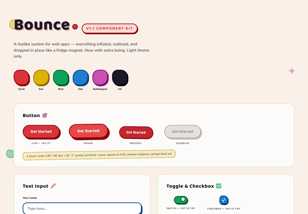
Soft shapes. Expressive feedback.
The design
A light, colorful system with inflated shapes, outlined controls and hard offset shadows. Motion adds squash-and-stretch feedback to buttons, cards and other interactions.
What I built
A component showcase exploring buttons, inputs, switches, badges, cards, tabs and accordions, with a consistent set of shapes, colors and interaction states.
Visit Bounce ↗Shonen UI
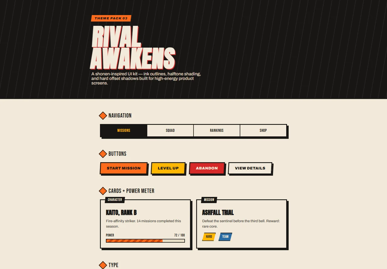
A visual system with energy.
The design
Manga-inspired ink outlines, halftone textures and hard shadows pair with expressive typography and a focused orange accent.
What I built
A themed HTML and CSS interface kit covering navigation, buttons, cards, badges and progress displays. The specimens explore how a strong graphic style carries across different interface elements.
Visit Shonen UI ↗